PROJECT PROPOSAL
I have chosen the theme of light and dark for my year 11 project. I like how light can drastically change an image if you place it in the right position. I understand that for this topic I will need to experiment with abstract photography and try to interpret the work of many light and dark photographers such as Darek Grabus who experiments with cutlery and everyday objects. I will think about the rule of thirds and leading lines when interpreting artists. I have a range of equipment that is needed to take photos which involve a high contrast between light and dark. I will try taking photos of objects that I find around the house and portraits of people. I need to be careful when thinking of a photo to interpret because I cannot photograph white, it needs to be a light source. For example, car headlamps, street lights and flash setups.
Mind map

My inspiration page
Here is a link to my pinterest board of light and dark. It has all the inspiration and some of the artists that I have found and used-
https://www.pinterest.co.uk/jameswfleet/light-and-dark/
https://www.pinterest.co.uk/jameswfleet/light-and-dark/
First experimentation with using light and dark
I found an old mannequin so I decided to plan a photoshoot around it. I thought that because the mannequin was meant to accurately represent a human body, I could learn how light and shadows wrap around people. After I took some photos involving the mannequin a the portable flash (seen below, bottom left) I found out that my Grandfather was coming over so i used him as the subject while using the portable flash and the and the Rouge ----------------. I altered the direction of light around his face after every photo. I used different light modifiers (Rogue) to adjust the shape of the light. This was my first light and dark photoshoot so it was purely for experimentation.
Equipment


The final image chosen from the first photoshoot

Evaluation of chosen image
In this photo I was experimenting with the portable flash and a black backdrop. I angled the flash onto the left side of the subject which would cast light over the figure and leave the right hand side of the image dark. I experimented by changing the power of the flash and the spread of the light. I used a white piece of paper over the flash to difuse the light which got rid of the bright white areas on the subject. If I redo this photo-shoot I will be more careful when framing the shot since I cropped off the bottom of the subjects base. Also i would increase the spread of the light since its legs are really dark. I could also place a white piece of paper opposite to the flash so that the light will reflect back to the right hand side of the mannequin, therefore making the subject more visible.
PHOTOGRAMS
I thought that photograms would be a creative way to present a light and dark photo. It shows me how to create photograms in a dark room which could prove useful later in life.
Method of taking photograms
Photograms or 'camera less photography is the art of light hitting printing paper (coated with a light sensitive emulsion) which will turn the paper from white to black. The artist will place certain objects (usually objects with unique patterns) onto the paper and when the light hits the exposed parts of the paper it will leave the covered up parts white. The paper is then placed in a sequence of chemicals. The first is the developer which will react with the exposed areas of silver in the paper's emulsion turning these parts black to form an image. Areas that receive more light become blacker when developed. Areas that receive no light stay clear. The next part is the stop bath which is an acid solution that quickly counteracts the developer to prevent over development of the paper. After that is the fixer, this dissolves any unused silver halides that were not developed and stops the paper from being light sensitive. Finally, is the running water which removes all traces of the fixer from the paper. This is all done in a dark room which consists of only a red safe light which will not affect the paper but will allow the photographer the see. Artists experiment with objects of different opacity like I have done below, This creates many shades of light on the paper.

Evaluation of photogram
This is my favourite photogram that I have ever taken. I have seen an image similar to this on the internet (seen below). That photographer used normal glasses so the viewer could see right through the lens. However I used graduated sunglasses so I got a result that is above. Because the earphones weren't flat, light seeped in underneath them that exposed that part of the image slightly leaving it darker than the centre of the earphones where the light couldn't reach. If I was to redo this photogram, I would choose different earphones don't have the little rectangular control setting on them because my eye is constantly drawn to it.
Inspiration-

ARTIST RESEARCH
Here is a list of artists that I have gathered off the internet:
.Darek Grabus
.Vincent Abbey
.Thomas Ryan Snider
.Andrew Crocker
.Enrico Salvadori
.Darek Grabus
.Vincent Abbey
.Thomas Ryan Snider
.Andrew Crocker
.Enrico Salvadori
Darek Grabus
About the artist
Lives and works in Gdank, Poland. Studied design graphics on the Academy of fine arts in Gdank and photography at school of photography in Sopot. Many photography exhibitions involve Darek because of his popularity in this current time.
Artists selected photo for evaluation and interpretation
|
I have chosen to evaluate this photo because I like how the forks placed against the wall creates leading lines in a triangular loop. The blacks and whites on this photo are soft and not harsh and I think both of the boards are white even though the backdrop looks black, that is the way the photographer has illuminated the image. The light has reflected off the foreground and cast a slight shadow above the forks. The photographer has fired the flash down on the image because of the strip of light on each fork, however the back of the forks are dark so he must have fired the flash directly down on the image without any light spilling onto the backdrop. I like how the contrast between the black backdrop and the white foreground is diagonal rather than a straight line travelling horizontally across the image.
|

|
My interpretation of Darek Grabus
For this photoshoot I will use a whisk and angle the flash directly down above the subject which will hopefully cast a star like shadow beneath the whisk. I am aiming for the background to be a different colour to the foreground so that there is the dominant division between them both. I will try to angle the camera so that the background is on a slope just to add a bit more of an abstract feeling towards the viewer.
Planning/method
I will use the YN560-II portable flash as seen in the experimentation photoshoot along with the Nikon d90 with the sigma 18-55mm lens. If you place a white piece of plain paper over the flash it will diffuse (soften) the light to give a less harsh feel to the photo. I will need to position the flash close to the top of the whisk so that the shadow is larger, however i am going to experiment different distances and decide which one gives the best effect.
Contact sheets


Selected images


My interpreted work in the style of Darek Grabus

Evaluation
This photo shows how the position of the light source can cast unique shadows on the image. I like how light has spilled onto the background and is casting a slight contrast between the floor and background of the image. I changed the power of the flash to a lower setting so that the ground of the image wouldn't be overexposed. In post-processing I added a slight vignette to draw your eye to the centre subject. I opened the photo in silver effects pro (black and white editing software) and increased the contrast and exposure slightly and decreased the structure which would soften the image. I don't like how the light shines off the peak of the whisk because my eye is drawn to the brightest part of the image.
My second interpretation of Darek Grabus

Evaluation
I shot this photo with a white backdrop on my white cupboard. I originally used a portable flash, however the lowest setting on the flash was too bright so I had to find something weaker. Next I tried out a torch, this was effective because when it was on I could constantly see the shadows so I could change the angle of the torch so that the shadows are in the right place. In post processing I used silver efex pro to lower the structure of the image so that the background of the image would turn out softer with less detail. If I would redo this photoshoot I would try to get the background darker by reducing the power of the torch.
Ryan Thomas Snider
About
Ryan Snider is a world famous photographer devoting his time to the popular photography website and app, flickr.
Sniders photo and evaluation
|
This photo is a creative way to use refraction to present a light and dark image. The dominant line in this photo is obviously the vertical centre line. Snider placed a flash on the left and the right of the image to define the edges of the glass and give the image some light. I wish that the photographer could've redone this photoshoot and made the centre line match up perfectly.
On the left of the image, you can see that the background is pure white and not the same greyish colour throughout the background. I am still unsure why Snider left the image like that because my eye is drawn to the brightest area of the photo. In my opinion, this photo suites not being on the rule of thirds as the glass is supposed to take up the entire frame since it is the only subject. |

|
My interpretation of Snider
To interpret the photo that Snider took I will add two glasses to the shot so that one glass will be black an other the other, white. I will use the one flash entering the shot from the left and a white piece of paper on the right to reflect the light back towards the shot.
Contact sheets for 1st photoshoot


Contact sheets for 2nd photoshoot


Selected images


The final interpreted photo
Before editing
|
After editing
|
Evaluation
For this photo i decided to use a plain white backdrop but i changed the colour of the water using food colouring. I originally tried to do a fast shutter speed of a drop of food colouring as it disperses into the water. Unfortunately, the dye didn't work as it sunk to the bottom of the water as a ball. I then had an idea to keep putting a lot of these green blobs of dye into the water then swirl it around. This idea sort of worked but my shutter speed was too low so it was blurred. After all the bubbles had broken down and changed the water green i just decided to take some photos as it was.
I wish the photo was a slight bit brighter so that there was a more dominant contrasting line between the white and the black on the bottom third of the image. I like that shade of green because it doesn't stand out too much against the backdrop. The dominant line in this photo is the vertical centre line and the bottom third of the image.
I wish the photo was a slight bit brighter so that there was a more dominant contrasting line between the white and the black on the bottom third of the image. I like that shade of green because it doesn't stand out too much against the backdrop. The dominant line in this photo is the vertical centre line and the bottom third of the image.
My interpretation of Ryan Thomas Snider
For this photo-shoot I will use the portable flash with a white piece of paper on the front of it to diffuse the light. I will position my camera straight on at the glass so that the line down the middle will be connected. I do not own two flashes so i will use a white piece of paper on the right side of the image so the light from the flash is being reflected back towards the wine glass.
Contact sheets

Chosen images for final interpretation

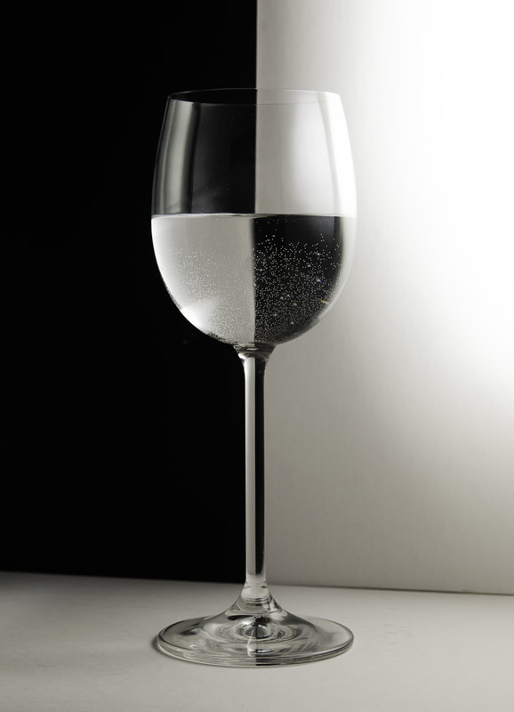
My final interpretation of Ryan Thomas Snider

Evaluation
I really like the contrast between the light and the dark in this photo. I like how the bubbles in the water create a little bit more detail in the photo. It was taken on my white cupboard with a black piece of card as the background. I place a flash at the right of the image pointing in towards the glass with a white piece of card over it to diffuse the light. On the left side of the image I had a white card positioned to reflect the diffused light back onto the glass. It took me a while to position the glass perfectly so that the cross section was directly in the middle. If was etempting the remove the bubbles I would boil some water first then let it cool down. This would obviously make the inside of the wine glass clearer which would maybe be more effective.
Vincent Abbey
About
Vincent Abbey is a professional portrait photographer who has taken the odd one or two photos of car lights and old classic vehicles.
Artist photo and evaluation
|
I have chosen to evaluate this photo because it is clearly resembles light and dark. I like the winding road that the photographer has used. The leading line in this photo is obvious and is clearly the main photographic technique. I like how the left of the road is red and the right is white it adds a sense of contrast.
|

|
My interpretation of Vincent Abbey
For this photo-shoot I am thinking of going to Winnats pass at dusk and photograph a slow shutter speed of the cars traveling up and down. I am hoping for one car to come down the valley as another one goes up, this will create a red light on the right of the road from the car up and a white light on the left due to the car going down. Because it is going to be a night time shoot and I cant see where I am focusing, I will need to focus just off infinity. that seemed to work when I was up in the Lake District taking photos of the stars. If a set the shutter speed on my camera to the maximum which is 30 seconds (I could use bulb, however if I keep my finger on the camera for longer than 30 seconds I would probably nudge it and the image would be blured) and a car is slower than 30 seconds, then the trail of the car will cut off part way down the valley leaving a gap of light in the road. To overcome this problem I will use my intervalometer so that I can leave the shutter open for as long as I would like without rocking the camera.
Contact sheet

Chosen images for final interpretation


Evaluation
I have narrowed this photoshoot down to these two final photos. The image on the left is my more obvious choice since you can see more of the surrounding area. Also. I think having the camera in portrait makes this kind of photo look more appealing to the eye since the car trails travel up the frame for a longer distance. However the photo on the right has a more bold trail of light rather than the left.
My final interpretation of Vincent Abbey

Enrico Salvadori
Artist photo

Contact sheets

My final interpretation of Enrico Salvadori

Andrew Crocker
Artist photo

Contact sheets


Selected photos for interpretation


Final chosen image

Evaluation
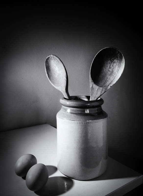
This photo was taken on the corner of my cupboard along with a singular flash and a piece of white paper. The paper was used to reflect the light back towards the image so that the shadows would be less dominant. I tried to use the rule of thirds in this image to make it more appealing to the viewer. I have not cropped the name well since the shadow of the egg has been slightly cut off.
Lucas Cobb
Chosen Artists photo

Contact sheets


Final chosen photo

